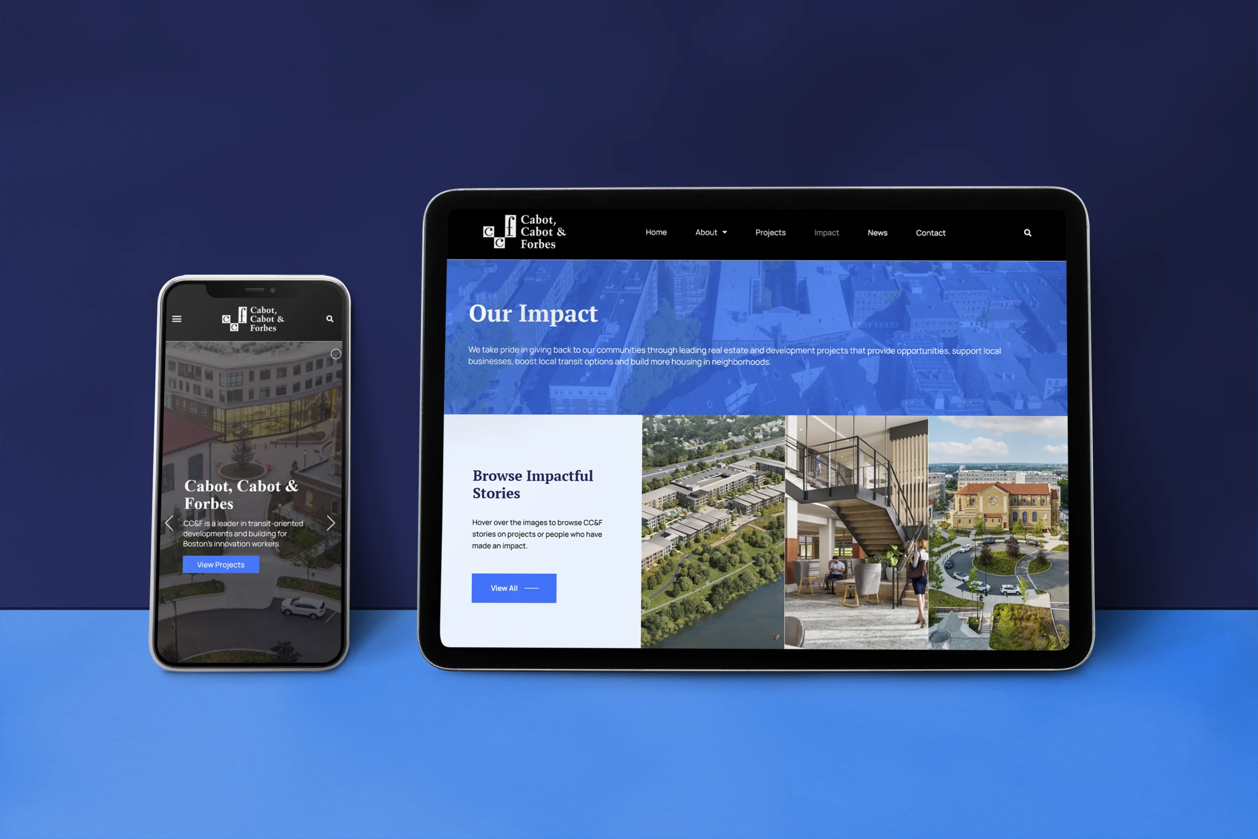
The Secondary Logo & Color Palette
During the design phase for the CC&F website, we provided the client with a variety of color palette options to choose from. After thoughtful consideration and analysis, the client ultimately opted for a striking color scheme that featured a blend of blues and bold orange tones. This palette was not only aesthetically appealing and contemporary, but also helped to bolster the client’s brand identity and messaging. The inclusion of bold orange accents and call-to-action buttons was highly effective in driving user engagement and conversions. Overall, our attention to detail and emphasis on creating a visually stunning and functional website resulted in a highly successful project for our client.
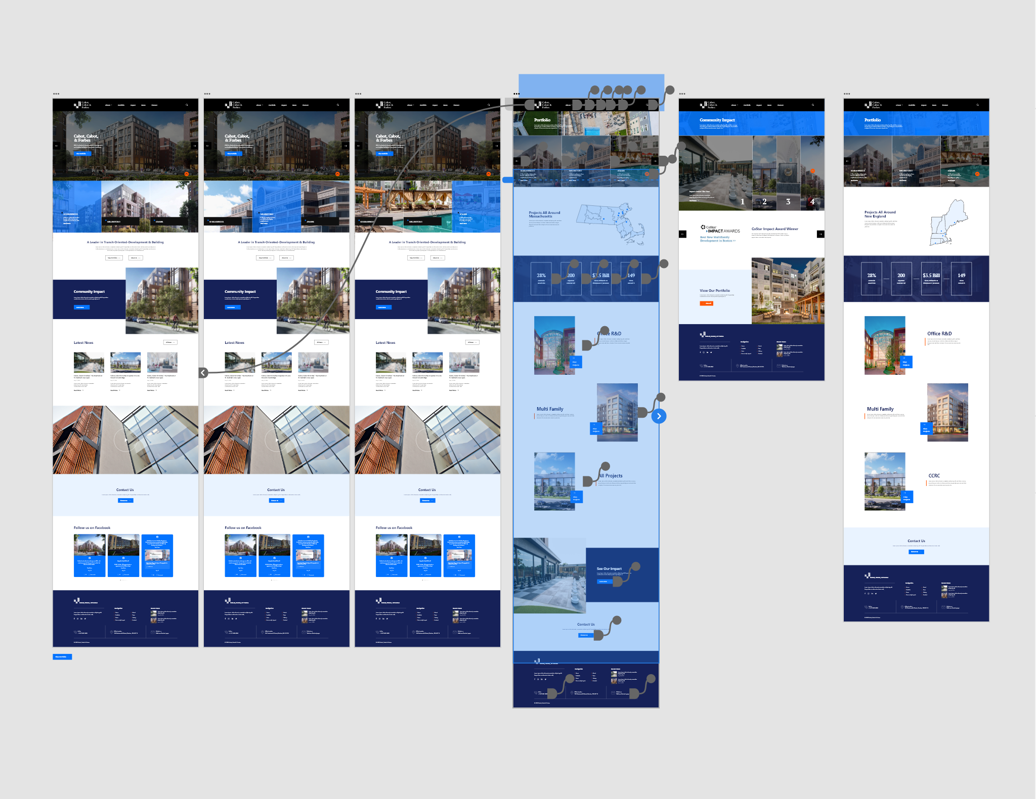
The Prototype
These prototypes were shared with the client throughout the design process for their feedback and approval. Once the designs were finalized and approved, our team proceeded to develop the site. Throughout the development process, both designers and developers used the prototype as a reference to ensure that the final product was consistent with the client’s vision. By utilizing interactive prototypes, we were able to streamline the design and development process, resulting in a successful and efficient project delivery for the client.

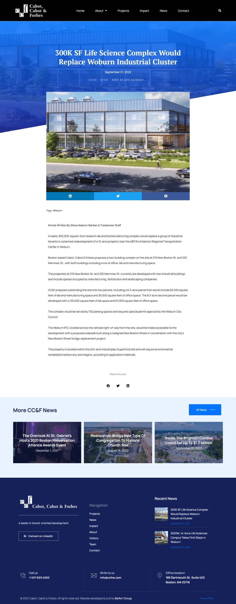
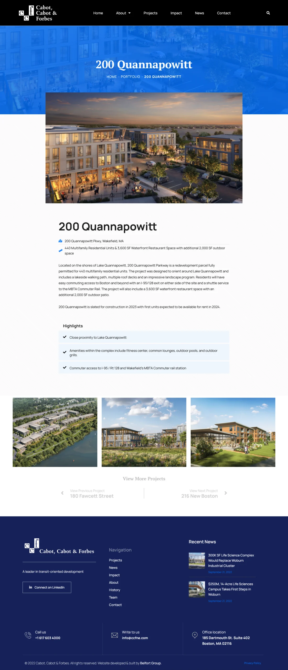
The Website
We designed custom template pages on WordPress based on the designs we had created in Adobe XD, enabling the client to easily update the site’s content when necessary, without requiring any coding expertise. This approach emphasized user-friendliness and functionality, ensuring that the website was visually appealing while also being practical and effective for the client’s needs.


